P r o c e s s
Port
folio
folio
Port
About my theme
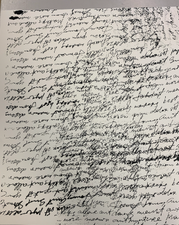
The power of Words has been an ongoing theme throughout my art works. Text/words are a powerful medium, one that can allow meanings to be malleable, and this has featured many artists who use language as a medium. The power of words is a remarkable phenomenon. Words can invoke powerful emotions and reactions, and can even shape our world. They can be used to inspire, to motivate, to heal, and to bring people together. They can be used to encourage, to console, to comfort, and to console. Words have the power to bring people together, to create a sense of community, and to foster understanding. They can be used to communicate ideas and to share stories, as well as to express love and appreciation. Words can bring beauty into the world, and can be used to create a sense of hope and optimism. Ultimately, words have the power to shape our lives, our thoughts, and our relationships. Following artist such as Christopher Wool, Jenny Holzer, Basquiat, and Adam Pendleton I have been constantly inspired those around us. And the power in which they depict throughout their artworks as well as motivations. My goal throughout my art is an attempt at dealing with the complexity of words, by quietly addressing the intricacy of overlapping and intersectional identities. Furthermore, the work in which you will see is their to create quite a capacious space and I aim for it to send a message not only to the audience but to individuals in order to further see the impact of words in our world and everyday lives today.
My idea relates around the psychology, in which indicates that negative stimuli, such as criticism and fear, tend to have a stronger effect on our brains than positive stimuli, such as praise and joy.
The artwork emphasizes the importance of focusing on the positive aspects of life and resisting the impact of negative words and thoughts. This concept is related to the idea of positive psychology, which focuses on building positive emotions, relationships, and experiences in life. Positive psychology research suggests that cultivating positive emotions and experiences can enhance well-being, resilience, and overall life satisfaction.
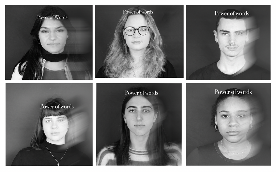
'The Untold Stories Project'
All my own photgraphy work
Camera Used: Canon 250d
Media: Digital
Tools used: Photoshop, Adobe illustrator, lightroom
The power of words is a critical theme in the artwork. Words have the power to inspire, motivate, and uplift, as well as to hurt, discourage, and harm. The artwork shows how negative words can create a mental prison that keeps us from experiencing the fullness of life. Conversely, positive words can create a mental sanctuary that nurtures our well-being and helps us thrive. Whilst I had experimented with different layouts and color schemes to create a visual representation of the concept of positive and negative words. Once I settled on a design, I created the individual frames using a combination of drawing, painting, and digital techniques. Additionally may have also added text overlays or hand-written words to create a more personal and intimate feel to the artwork. Overall, "The Untold Stories" is a powerful reminder of the impact of words on our lives and the importance of focusing on the positive aspects of life.
Photos taken by Me (my own work)
Photos taken by Me (my own work)
Photos taken by Me (my own work)
My own work
My own work
The process of this piece
This piece will be a collection of individuals, in order to show one's story and how we all have our own story to tell. Whilst isn’t quite empowered or surrounded by physical words. The individuals have their own story to depict. The answers just lies within the concept of not judging someone without knowing their story. Projected with words of their storys is still something in which I am in the making and creating of. However hope to portray words in some form in order to fully graspt and take my theme to a more advanced level.
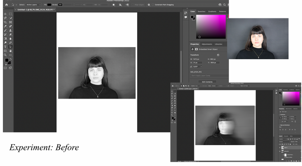
This process allowed me to really use online tools in which I have not been 100% comfortable with. Whilst watching youtube videos, or asking teachers around me I have been able to grow my understanding as well as my skills within this project. Whilst are not enhanced photoshop or adobe skills I was able to fully depict the intended message of this project.
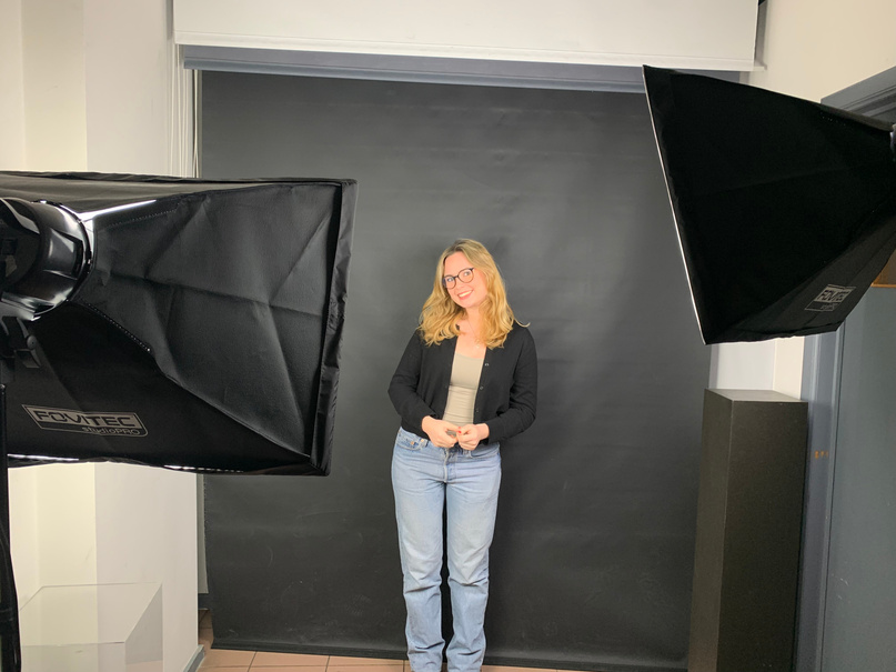
The set up before taking the photos, using a black backdrop in order to enhance that darker feeling of the indavdiual being able to focalise on their emotion and depiction
My own work
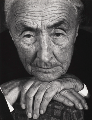
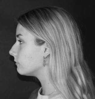
While being inspired by Ansel Adams. I was captured by the ideas that Adams’ portraits were characterized by their timeless quality and attention to detail. He captured the essence of his subjects through his use of light and shadow, composition, and his expert printing techniques. His portraits were not only beautiful, but they also often revealed something about the character of the subject, making them powerful and emotional.
One of the most famous portrait pieces by Ansel Adams is his portrait of Georgia O’Keeffe. The photograph was taken in 1936, and it shows the iconic artist and photographer looking pensive and contemplative. The image is soft, yet the focus is sharp, and the use of light and shadow gives the portrait a sense of depth and emotion.
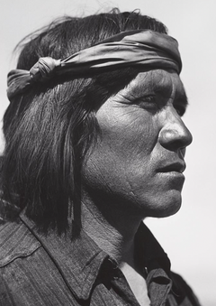
Another notable portrait by Ansel Adams is his photograph of a Native American, which was taken in 1941. This photograph is considered one of his most powerful portraits, as it captures the intensity and strength of the subject’s gaze. The use of light and shadow creates a sense of mystery and gives the portrait an almost otherworldly quality.
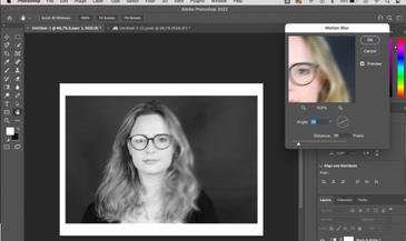
Experimenting with color, layout, blurs ccurves, hues of the image
Firstly, I had selected the appropriate lens for the shoot. For portrait photography, lenses with a focal length of 50mm or higher are often preferred as they offer a flattering perspective and shallow depth of field. The Canon 50mm f/1.8 STM lens is a popular choice for portrait photography and would be compatible with the Canon 250D camera. With a shutter speed of 1/4000
The Canon 250D camera also offered a range of image quality settings, including JPEG and RAW formats. Therefore shot in RAW format to have more flexibility in post-processing and to capture the highest level of image detail.
Overall, the process of using a Canon 250D camera for portrait photography involves selecting the appropriate lens, adjusting the camera settings for optimal exposure and focus, and shooting in the desired shooting mode and image quality settings. This was quite difficult step however once getting use to this I was really able to fully complete this and really understand the techniques in which came with this process
ansel adams portrait of Geogria O'Keeffe 1936
The power of words plays an important role in Adams' work thus he saw his work as a way to inspire others to take action to protect the environment, and he used words as a tool to communicate this message.He used words to articulate his vision and to give context to his images, creating a deeper understanding and appreciation for his work. He also wrote about the process of photography, sharing his technical knowledge and experience with others, and inspiring a new generation of photographers. Finally, the titles of Adams' photographs are also an expression of the power of words. He carefully chose each title to reflect the mood and atmosphere of the image, and these titles have become an integral part of his legacy. They add meaning and depth to his images, and help to communicate the emotion and message that he intended to convey.
ansel adams portrait of native 1941
ansel adams portrait of A Native American 1941
Reflection on Original- thumbnails
Photos taken by Me (my own work)
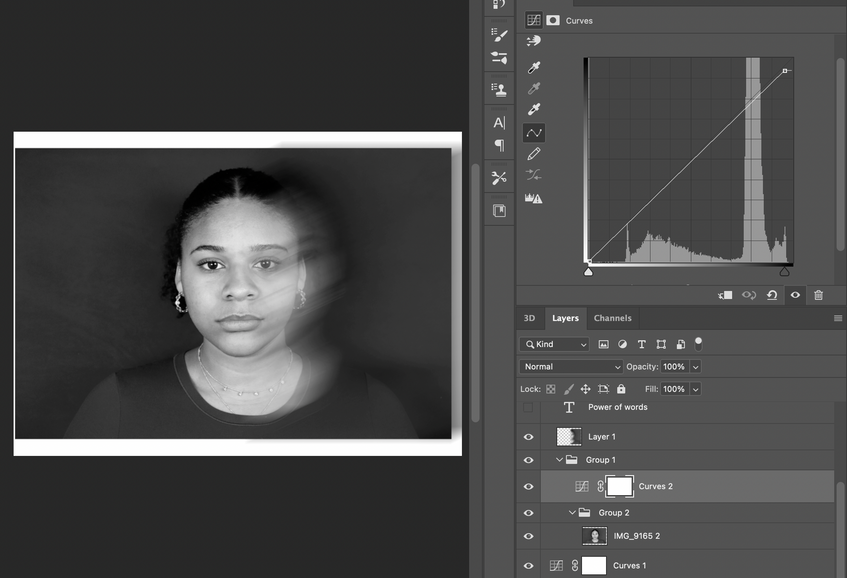
The decision to narrow down the artwork to only three portraits may have been influenced by several factors. Firstly, symmetry and consistency may have played a role in the selection process. By choosing three portraits of a similar size and orientation, the artwork achieves a sense of balance and harmony. Additionally, by excluding portraits with titled heads, glasses, or darker tones around, the artist may have been aiming for a more minimalist and uniform aesthetic.
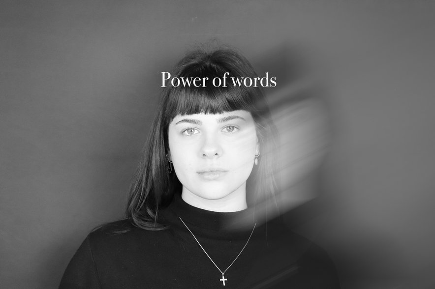
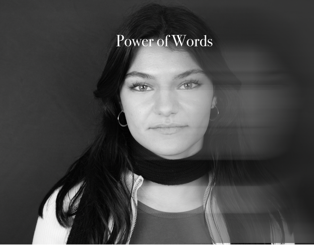
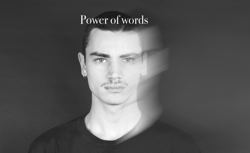
Furthermore, the decision to have only three portraits may also have been a deliberate artistic choice to emphasize the power of words. By having just three portraits, the negative mental (in which arn't depicted) in the larger male figure frame have a more significant impact and feel more overwhelming. The two smaller female frames, depicting positive words (mental), creating a sense of contrast and balance against the negative words. Having too many portraits may have diluted this impact, making the message less clear and powerful.
In addition, the number three holds significant symbolic meaning in various cultures and beliefs. For instance, it is often associated with balance, harmony, and completeness. In Hinduism, the Trimurti represents the three main aspects of the divine in society. By using three portraits, the artwork may be invoking this symbolic power and reinforcing the message of balance and completeness.
Overall, the decision to narrow down the artwork to three portraits was likely a deliberate artistic choice aimed at achieving a minimalist and symmetrical aesthetic while reinforcing the message of the power of words.
Photos taken by Me (my own work)
Own resolved work
Photos taken by Me (my own work)
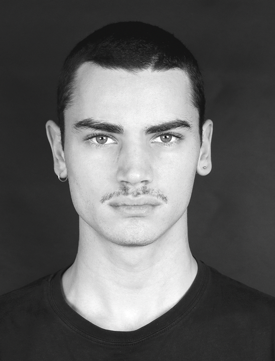
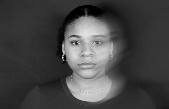
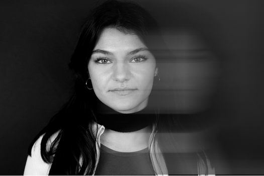
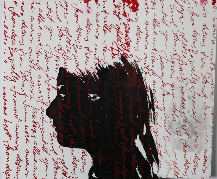
"The Untold Stories" is a powerful piece that illustrates the impact of words and thoughts on our mental well-being. The contrast between the larger A3 frame of the male figure surrounded by negative words and the two smaller A4 frames of the female figures displaying positive mentalities highlights the disparity between the attention we give to negative versus positive words. This piece is a poignant reminder to focus on the positive aspects of life and to resist the impact of negative words and thoughts.
In our daily lives, it is easy to get caught up in negative self-talk and rumination. We may find ourselves dwelling on our flaws, mistakes, and shortcomings, while failing to acknowledge our strengths, accomplishments, and positive qualities. However, "The Untold Stories" urges us to shift our focus and pay more attention to the positive aspects of life. By doing so, we can cultivate a more optimistic outlook, increase our resilience, and improve our mental and emotional well-being.
Moreover, this piece is a call to action to be mindful of the words we use, both towards ourselves and others. We must be careful not to let negative words and thoughts dominate our minds and emotions. Instead, we should strive to use positive and uplifting words to build ourselves and others up. By doing so, we can create a more positive and supportive environment for ourselves and those around us.
In conclusion, "The Untold Stories" is a powerful reminder of the impact of words and thoughts on our mental well-being. By focusing on the positive aspects of life and resisting the impact of negative words and thoughts, we can improve our mental and emotional well-being and create a more positive and supportive environment for ourselves and those around us.
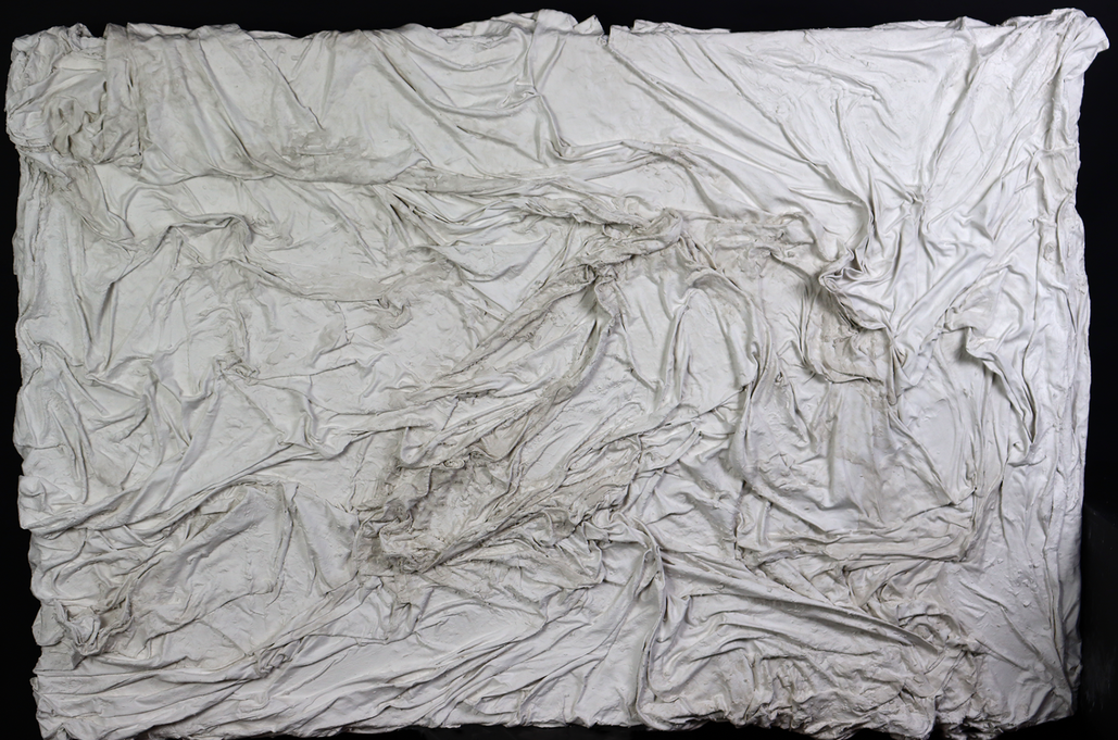
Initial Idea
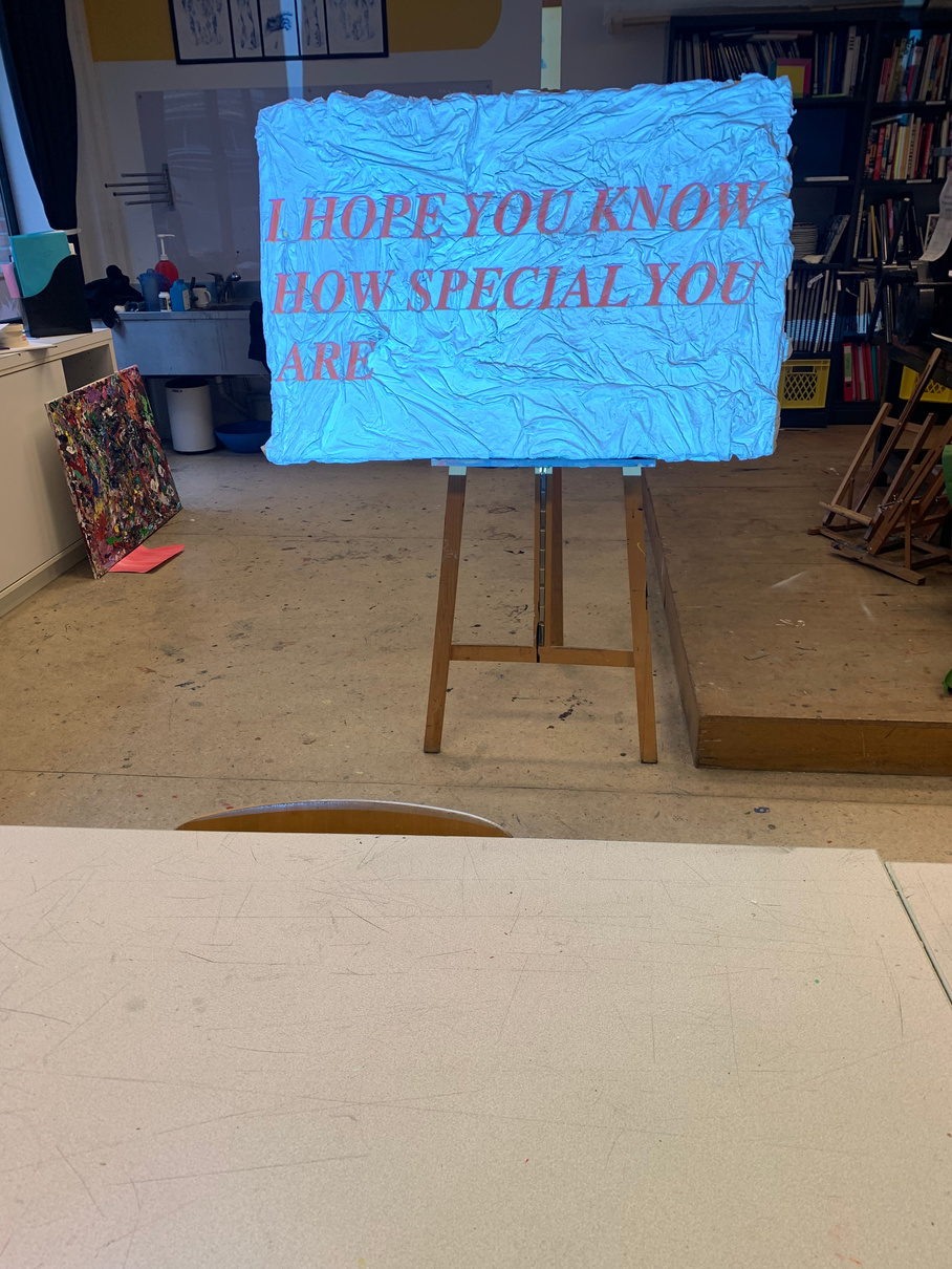
For this piece I wanted to evoke the feeling of 'comfort words' and a place of saftey. Words have the power to evoke feelings and create memories, and when it comes to comfort, there are certain words that immediately come to mind. My goal was to be able to have an art piece that could portray this feeling to the audience in an imerssive way.
When you imagine a sheet dipped in plaster, you can visualize the way the material wraps around it, encasing it completely. This image brings to mind the idea of being enveloped in a protective layer, just like a sheet provides comfort and warmth when we are tucked in under it.The process of dipping a sheet in plaster is also a form of transformation. The sheet is transformed from a simple piece of cloth into a solid, protective surface. This transformation symbolizes the way comfort can change us and make us feel stronger, more secure, and more resilient.
Photos taken by Me (my own work)
The 'sheet's' in this art piece should be able to ressemble and symbolise the feeling of bed sheets. Thus Bed sheets can represent the comfort and power of words in a few ways. Firstly, bed sheets can be seen as a symbol of comfort and security, providing a soft and cozy place to rest after a long day. In the same way, words can provide comfort and support to those who hear them, offering reassurance and solace in difficult times.Additionally, bed sheets can also be used to express one's personal style and taste, reflecting one's unique personality and individual preferences. Similarly, words can also convey power and personality, with the way someone speaks and the words they choose having a significant impact on how others perceive them. For example, confident and assertive language can exude power and influence, while kind and compassionate words can convey empathy and understanding.
This idea then lead me to utilising material that was almsot as similar to this and thin enough to manipulate. Whilst also wanting to replicate the 'ripples' as well as scrunch waves of the bed sheets. A couple ideas at first came to my mind when wnating to do this and that was, could be to use fabric, such as silk or chiffon, that is lightweight and easy to manipulate. This material can be shaped and arranged to create the desired rippled or scrunched wave effect. This could be done through techniques such as pleating, gathering, draping, and tying the fabric into knots.Another option was to use a material such as paper or plastic film, which can be cut and manipulated to create a similar effect. This could involve cutting and curling the material, or using a heat gun to shape it into the desired form. However I decided to stick with a thin material and manipulate it throughout my process.
My own process work
Photos taken by Me (my own work)
Photos taken by Me (my own work)
Photos taken by Me (my own work)
An artist that inspired me throughout this art process was, Louise Bourgeois who is a French-American artist known for her innovative use of materials in her sculptures. One of her most iconic materials was plaster and cloth, which she used to create expressive, abstract forms that explored themes of identity, gender, and sexuality. 'Bourgeois would draw and keep diaries throughout her life but her prolific artistic output was never dedicated to a single material or process. She worked in a variety of mediums, creating sculptures and environments in bronze, wood, glass, metal, fabric, plaster among other materials.'
(https://www.nationalgalleries.org/art-and-artists/features/louise-bourgeois-learning resource)
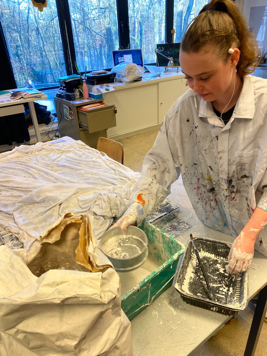
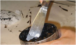
Something in which was interesting about this process was sieving the plaster as was an important step in the process of creating a textured surface on a canvas using the technique of dipping cloth or sheet into plaster. The purpose of sieving the plaster is to remove any lumps or impurities that may have formed in the mixture, ensuring that it is smooth and free-flowing.
Whilst Patience was really important within this step, sieving the plaster was a time-consuming process, and it requires patience to ensure that it is done correctly. This patience is an important lesson in art-making, as it demonstrates the importance of taking the time to properly prepare materials and techniques.
Importance of Preparation was also realised as sieving the plaster is important it highlighted the importance of preparing materials and techniques properly before beginning any creative work. This lesson is relevant not just to the process of dipping cloth into plaster, but to all forms of art-making.
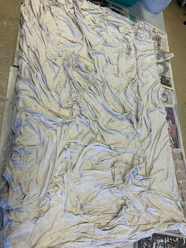
The process of dipping a cloth or sheet into plaster and using it to create a textured surface on a canvas is a technique that has been used in various forms of art-making. The process involves creating a mixture of plaster and water, dipping a cloth or sheet into the mixture, and then pressing it onto a canvas. The plaster-covered cloth or sheet is then left to dry, creating a textured surface that can be painted or decorated.One of the challenges of creating a piece using this technique is ensuring that the plaster mixture was the right consistency. If the mixture is too thin, the cloth or sheet will not adhere properly to the canvas and will not create a strong textured surface. If the mixture is too thick, it may be difficult to work with and may not dry evenly, resulting in a weak and irregular texture. Another challenge was controlling the depth of the texture. The depth of the texture is determined by the thickness of the plaster mixture, the time it is left to dry, and the type of cloth or sheet used. It can be difficult to achieve a consistent and uniform texture across the entire surface, and had be careful to ensure that the texture does not become too deep in some areas, making it difficult to paint or decorate. As well as stappeling this piece onto this canvas was an even more hastle as we had to work in two in order to make sure that with the weight of the piece it would not just crumble but as well as the hope that it would stay onto the canvas when hung on a wall.
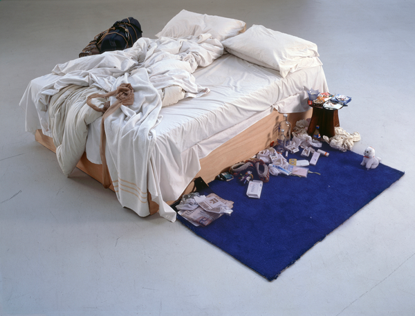
Emin's "My Bed" is a deeply intimate and personal work that reflects her own experiences with depression, heartbreak, and self-destructive behavior. The bed itself is a symbol of comfort and security, but it is also a place where Emin has spent many hours in despair and anguish.
In many , "My Bed" by Emin can be seen as a physical manifestation of Emin's own psyche, with the disheveled sheets and cluttered surroundings representing the chaos and confusion of her own inner world. By displaying this deeply personal and private space in a public setting, Emin invites the viewer to confront their own experiences with vulnerability, intimacy, and mental health.
In this sense, Emin's bed can be seen as both a physical and emotional comfort zone. It is a place where she can retreat from the outside world and find solace in her own thoughts and feelings. However, it is also a place where she has experienced intense emotional turmoil, reflecting the complexity and fragility of our own emotional lives.
(my own work)

Media experimentation is also an important skill that an artist can learn from this artwork. The use of plaster and cloth to create a tactile and personal touch in the piece adds depth and texture. Experimenting with different materials and textures can add a new dimension to an artwork, making it more engaging and memorable.
The bed itself is a symbol of comfort, but it is also a deeply personal space that speaks to the artist's own struggles with mental health and identity.
Similarly, to 'comfort zone' in which uses a piece of cloth dipped in plaster stealing the texture from Tracey Emin and El Antasui. To symbolize comfort and security, with the plaster representing permanence. The words projected onto the surface of the cloth further reinforce the idea of comfort and safety, encouraging the viewer to step into their own comfort zone.
Both artworks also explore the interplay between physical and abstract elements, with Tracy Emin's "My Bed" incorporating a variety of personal objects and the piece you described using texture and depth to create a tactile element.
As an artist, one can take away from both of these artworks the importance of personal expression and the power of symbols and language to convey meaning and emotion. They also highlight the value of exploring the interplay between physical and abstract elements to create a dynamic and meaningful artwork.
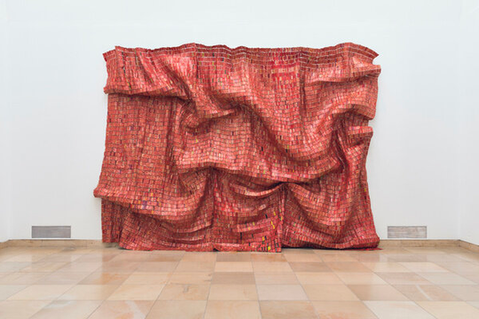
One such artist is El Anatsui, a Ghanaian sculptor who is known for creating large-scale installations from discarded materials such as bottle caps, metal, and other found objects. Anatsui manipulates these materials by folding, crumpling, and weaving them together to create intricate and highly textured works that resemble fabric or drapery. use materials in unconventional ways to create textural effects and sculptural forms in their work, much like the bed sheet material in "The Untold Stories" artwork. By manipulating these materials through folding, crumpling, weaving, and other techniques, they create complex and dynamic forms that engage the viewer's senses and evoke a wide range of emotions and associations. El Anatsui's "Red Block" is a large-scale sculpture made from discarded aluminum liquor bottle caps that are woven together to create a striking, textured artwork. However from afar the artist is able to create a texture such as a 'matieral cloth' like which was utilised within my rceent art pice.
Size: 80x130
Media: Dipped cloth in Plaster placed on Canvas
This art piece of mine explores the concept of comfort and its impact on our lives. I have taken a piece of cloth and dipped it in plaster before placing it on a canvas, symbolizing the solidification of comfort in our lives. The cloth, soft and flexible, represents the idea of comfort, while the plaster, hard and unchanging, represents the permanence of our comfort zones.The texture and visual depth created by the plaster on the cloth creates an interesting contrast between the softness of the cloth and the solidity of the plaster, adding a tactile element to the piece that draws the viewer in. The use of a single piece of cloth also adds a personal touch, making the piece relatable and intimate.
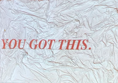
Furthermore, ‘comfort words’, are being projected with a projector onto the surface of the canvas/cloth (which can be seen below as a video) and are meant to envelop the viewer in a sense of safety and security, encouraging them to step into their own “comfort zone”. Creating an environment where the viewer can let go of their worries and simply be in the present moment. The combination of the physical texture of the plaster cloth, the words of comfort, and the light projection creates a unique and powerful work of art. With the projection of words onto the rough texture of the plaster cloth creates a dynamic interplay between the physical and the abstract, between the solid and the ephemeral.
My own work
'Comfort Zone'
Own resolved work
(my own work)
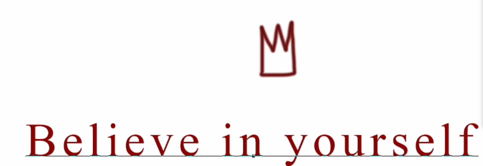
(my own work- video projection in which plays onto the tapistry/ with the symbol of the 'crown' which repeateadly shows up in other artworks as well.)
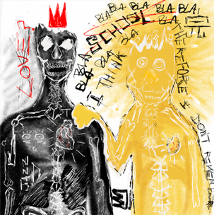
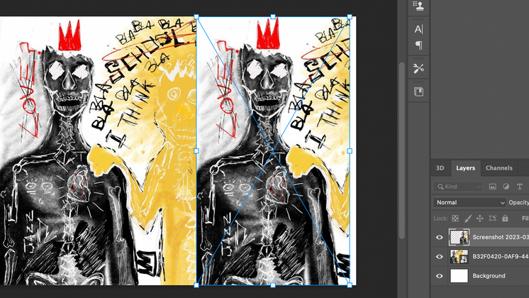
In this piece, the people and the skull serve as symbolic representations of the individual and their unique perspective. The yellow being next to the skull suggests the importance of imagination and creativity in making sense of the world and developing one's own perspective. The crossed-out "love" symbolizes the rejection of certain messages or sentiments that may not align with the individual's personal beliefs or values.
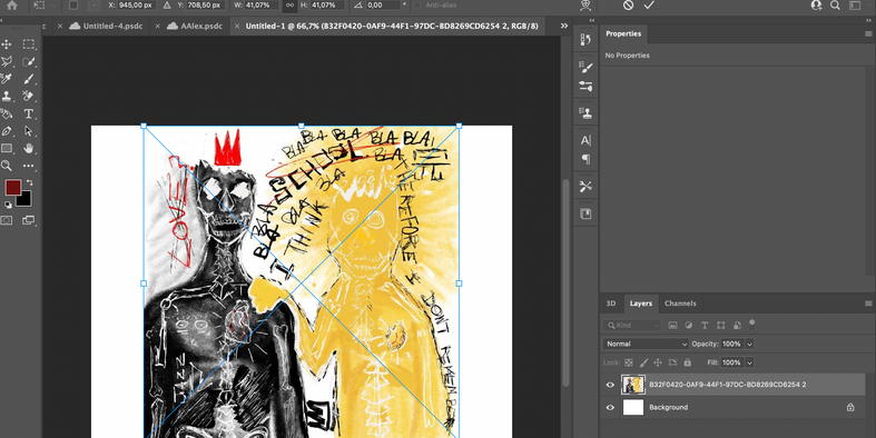
The process of creating this digital art piece likely involved a series of trials and errors, as the artist experimented with different color schemes, fonts, and symbols to effectively convey the message. Whilst also gone through several iterations of the piece before arriving at the final version. The use of digital tools allows for greater flexibility in editing and refining the artwork. Using a tool in which I had never used nor been familiar with was a very difficutl at first. However after a little time of playig aorund with the data base and with practice and experimentation, I was able to become more familiar with the app and start creating things in which I felt told a greater story in a new medium.
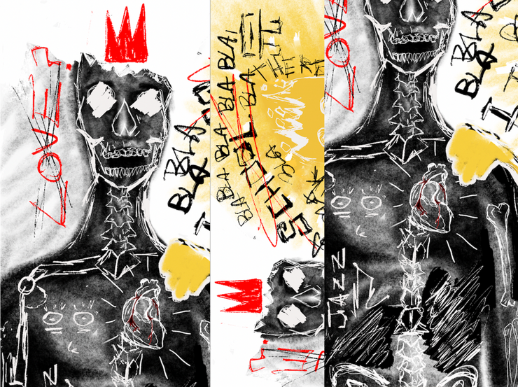
‘The Tragic Love story’
‘The Tragic Love story’
App used: Procreate & photoshop & Procreate
21.0 x 29.7 cm
Printed version ( A4)
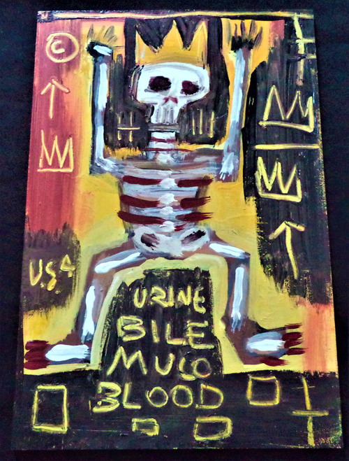
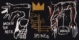
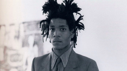
Basquiat Artist
All images on this slide are my own work
This digital piece of art depicts the idea that in today's society, we are constantly bombarded with words and messages from others, some of which we embrace and some of which we reject. The "blah blah blah" text represents the noise and distraction of these words, while the crossed-out "love" symbolizes the rejection of certain messages or sentiments. The yellow being next to the skull further represents imagination or the unique perspective of the individual, suggesting that in the midst of all the noise and conflicting messages, it's important to hold onto our own perspective and use our imagination to make sense of the world.The power of words is central to this depiction, as words have the ability to shape our thoughts, emotions, and beliefs. The words and messages that we choose to accept and reject can have a profound impact on our lives and the way we see ourselves and the world around us. In this sense, the art highlights the importance of being mindful and discerning when it comes to the words and messages that we allow to influence us.
Basquiat's work often featured juxtapositions of opposing ideas, such as wealth and poverty, fame and anonymity, and life and death. This digital art piece also includes contrasting elements, such as the "blah blah blah" noise and distraction of external messages versus the individual's unique perspective represented by the yellow being and skull. Moreover, Basquiat often used a combination of media, such as paint, markers, and found objects, to create his art. The digital art piece similarly uses a combination of digital media, including text, symbols, and color, to convey its message. Overall, while this digital art piece may not directly reference Basquiat's work, it shares some similarities in terms of its use of symbols and language to comment on social issues and the importance of individual perspective.
The use of Basquiat's body parts and the human body of anatomy in the "Tragic Love Story" digital art piece adds to the overall theme of individuality and unique perspective. Basquiat himself often incorporated human anatomy and body parts into his artwork, as a way of commenting on society and the human condition. In this piece, the use of Basquiat's body parts not only pays homage to the artist, but also serves as a reminder of the importance of individual expression and the need to resist conformity.
Furthermore, the use of human anatomy in the piece serves as a commentary on the power and fragility of the human body. The skull, for example, is a common symbol in artwork, often used to represent death and the impermanence of life. In this piece, the juxtaposition of the skull with the yellow being and the "blah blah blah" text emphasizes the need to maintain a sense of individuality and creativity in the face of societal pressure and the fleeting nature of life.
Overall, the use of Basquiat's body parts and human anatomy in the "Tragic Love Story" digital art piece serves to convey a powerful message about the importance of individual expression and the need to resist societal pressure and conformity.
All Photos taken by Me (my own work)
Own resolved work
The layers were then added ontop in order to create multiple effects to create the feeling of a story life between the 'protagonist' of the story thr 'skull' the 'imagined' human next to the skull. Utilising tools such as photoshop, and tools to eliminate elements were additionally added to create a more in depth story. Furthermore the symbol of the crown becomes a repeating image within the piece itself .In a world where words and messages are constantly bombarding us from various sources, it is important to recognize the power they hold in shaping our beliefs and perspectives. This digital art piece reminds us of the importance of maintaining a sense of individuality and creativity in the face of societal pressure, and being mindful of the messages we allow to influence us.
My own Art work and images
Process & Trial and Erros
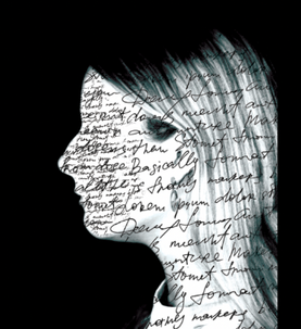
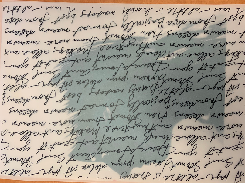
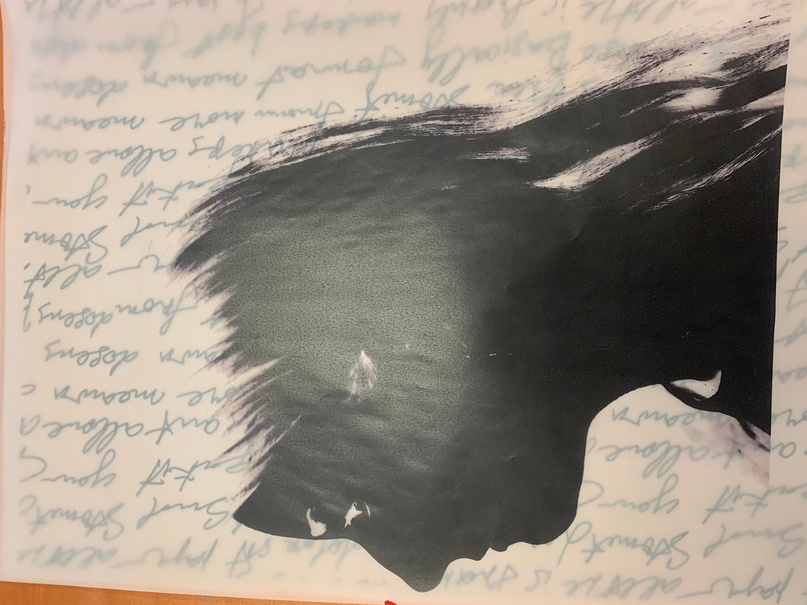
- I initially considered writing words on a newspaper cover to depict propaganda and the words we encounter in daily life through news and social media. However, after trying this out using high-end magazine covers such as "The New York Times," I realized that the powerful figures featured (e.g. the Queen, Donald Trump) and big headlines (e.g. "COVID-19 Pandemic") conveyed a more dominant message on behalf of influential individuals and well-known magazines. And the begging of it all. With this in mind I decided it did not in any way connect to social media, nor the news. Thus whilst were news articles the words in themselves were portraying a more significant message of the behalf of power individuals. And big named magazines.
3. In addition to this I placed my image into photoshop and started layering different layers and using different techniques in order to create and see the potential outcome in which it would have on my final piece. Moreover I really liked this effect in which it gave. I then used a tool to erase and tried to see a different viewpoint from it. What this did was erased the words on her face in order to make it less busy then shown on the image to the right. Thus because the words in which are utilised are not readable this gives the audience a feeling of uncomfortableness, but as well as making it too ‘cluttered’ seem as though it would not portray my message in the means of which I hoped for.
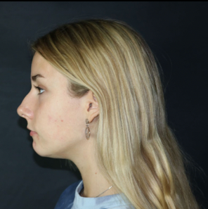
The 1st image on the left was taken with a Canon camera, and was one in which I had never used before. Furthermore was very nice to experiment with and to capture different angles and emotions. But as well as pure steadiness.
Photos taken by Me (my own work)
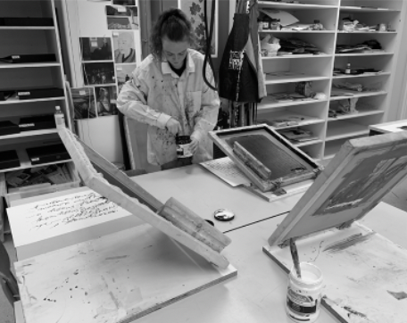
Steps I went through for Preparing the screen's: A stencil of the design to be printed is created on a fine mesh screen was created (from a photograph taken of a student)
Then the exposion of the screen: The stenciled screen was placed on top of a film positive of the design and exposed to ultraviolet light, which hardens the emulsion on the screen, creating a barrier to the ink.
Then this was washed with water to remove the unhardened emulsion, leaving the stenciled design in the mesh.
I then had to prepare the ink: The desired ink color was and loaded onto the screen for this step I decided to play around with the colors. Whether being all black or all red. I initially decieded to go for an all black. But then I found that in many of my pieces the constrast of 'red' (bergendie) and blakc meshed really well together. Creating a very pleasing color contrast of this piece.
The next step was to Print the design: The screen was then placed on top of paper and was a screenprint conducted on paper, and the ink is pushed through the stenciled design onto the substrate using a squeegee. This process is repeated for each color in the design. And after many trials and errors I was able to obtain a final piece.
Repeat: The screen printing process was repeated for each print run, until the desired number of prints is produced.
Photos taken by Me (my own work)
Using transparent paper to play around with the layering as well as the formats as well as a couple trial and errors (also shown on the right)
My own Art work and images
Photos taken by Me (my own work)
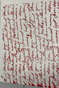
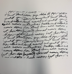
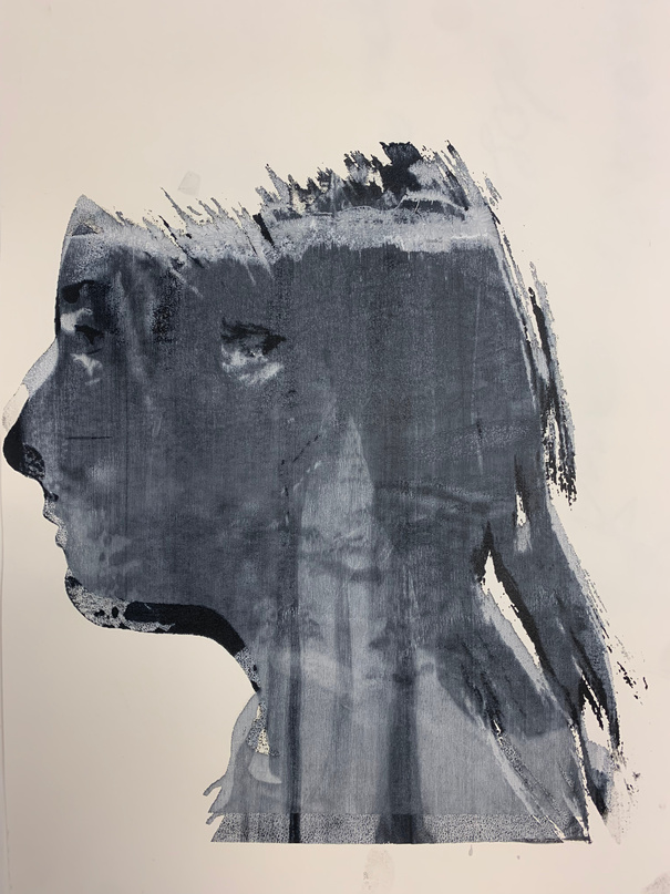
'The Shielded Girl'
My own Art work and images
Size: 38x54
Media used: Screen Printing on paper
Tools used: Photoshop, Mockups
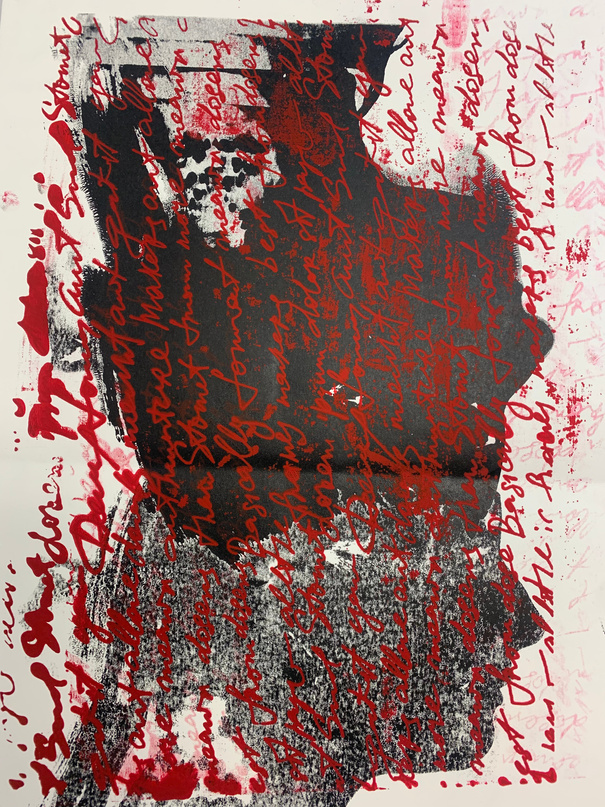
In this screen print, I aimed to depict the power of words and their lasting impact, both physically and mentally. The consistent theme throughout the piece emphasizes the idea of words being ingrained or engraved. Although the words in the image may be unclear to the audience, it invites them to use their imagination and contemplate the message being conveyed. The screen printing process itself adds a deeper layer of meaning, as it leaves a mark on the page, much like words can leave a mark on a person's thoughts and beliefs.
The screen print created focuses on the idea of the lasting impact of words. The choice to use screen printing as the medium for this piece adds to the message, as it creates a physical impression on the page, similar to how words can make a lasting impression on someone's thoughts and beliefs. The framing of the piece with glass symbolizes protection and preservation of the impact of the words, emphasizing the idea that once words are spoken, they are difficult to erase. The unclear words in the image encourage the audience to use their imagination and contemplate the meaning being conveyed, adding a deeper layer of interpretation to the piece. Overall, the screen print is a visual representation of the power and permanence of words.
Own resolved work
My own process work for a piece in which was not utilised but turned into another thought of idea
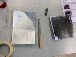
This was my first idea, in which I started with a photo taken from the internet. I then had to color in the entire back of the image with stencil in order to be able to have a tract when placing it on tohe etching sheet/milkcarton. Next the stencil was placed onto an etching piece of paper and in prepperation I taped it on In order for it not to move place when tracing over the image.
After I went over the image with a pencil it could have been done in pen to but I was using a pencil, this was a small problem I faced, due to the fact that it was hard for myself to see where I had gone over thus the lines on the image weren’t very clear. Hence why you an notice in the first image I changed to doing it in a blue pen so that I was able to notice my lines.
Next I went over it with a graver /etchign pen. This was to define what parts of the drawing I wanted to stand out the most. In the case it was just tracing the image again in order for it to be more defined and to really show the details in which surronded the image in itself. After this I decided the carve some areas out in order to really create a dark tone. Thus whatever was carved out completely was turned in a darker tone.
The image was then covered in a think type of gluey ink which covered the entire ‘picture’ this then created a completely black portrait of the image. However onced applied, I was able to take it off with a material a bit like a rag. In which was able to take off the ink till it reached a light medium toned grey. This then allowed for me to shade the image.
The image was then placed into the printing press and was able to come out looking quite dark but with beautiful patterns and outlines around it. This is something I really loved, about etching on this type of material. However I really wanted a cleaner version. Hence why I decided to change to acetate sheets.
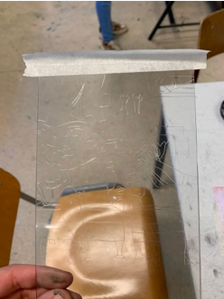
Initially when doing this next step I started on the milk carton, thus I felt more comfortable with it because I had done etching on this material before however I wanted something a bit more clean and that captured the picture nicely, while standing out. Hence why I decided to change it to acetate sheets, which were transparent like shown in the image above. These were great for the final piece and for that clear image. However I did face difficulty when drawing on it thus it was veery hard to see the image. Which is why I then decided to flash a light under/over it in order to see those detailed lines embedded within the piece.
Photos taken by Me (my own work)
A man's Wolrd
Etch on milk cartoon
My own pice of work in which I was going to use however I decided to incorporate the message into another piece but still had this piece as apart of my trial and errors (did not use this into my final exhibition) Was a piece into I did not particularly llove
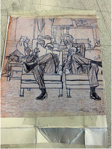
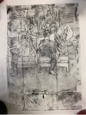
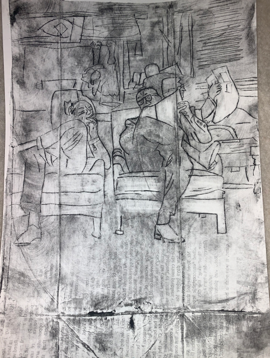
For my final piece (for this piece) I was not able to finish it due to going back into hybrid I think for myself this was a really hard process and was something I think I could really improve on within 2022. as well as think I could’ve pushed myself a lot further than I had done. As well as the break I think I had taken it for an advantage but actually was a great disadvantage for this project and is something I was very disappointed within myself for, and was one of my biggest regrets thus I think I worked a lot harder on the experiment than I did my final and because of this I was not able to finish my final hence due to not being able to finally print it. However I really loved my experiment piece, and I found it told a great story. Thus it has a room filled with men reading a news paper in a very manly empowered position with their leg crossed over in that way. You can also notice the cigarette in the man on the lefts hand. For me the whole story is told within this price thus the magazine was imprinted onto the final piece itself rather than a separate piece of paper with it on top. And whilst I would’ve preferred that I think this very well also shows that idea of the newspaper. For me this was really important to show thus I wanted to viewer to realise that there was more to story that what we see. Just like there is more too women's rights and equality then what we read on the news. Because it is such an in depth topic I wanted the viewer to understand that. While my initials intention was to have to newspaper say something about women becoming more involved and included it was very difficult to add that detail thus the process of adding an article stating that was very difficult to do thus many articles actually failed to imprint their text onto the sheet And that is something I would’ve changed. But if I could start again I was personally have done it with the newspaper being the background of the entire sheet and then printing them onto it instead of it being imbedded on.
(my own work)
This is the piece in which gathered inspiration from 'a Man's world' above
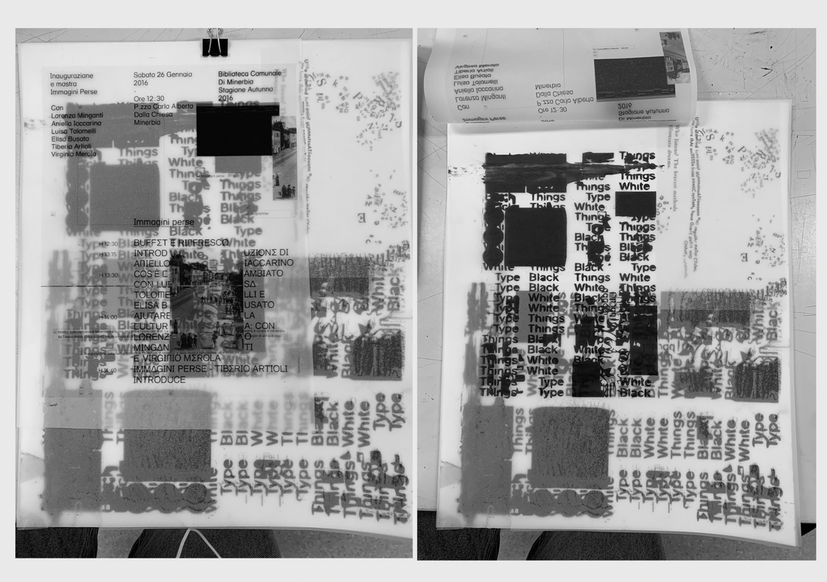
Size: A3
Material: iNK Print on Vellum paper
Experimenting for future prioject's using Vellum paper, and printing words and fonts onto it. Whilst the image in which has been printed stating 'typethings white/black ' is not my orginal design I made sure to use is as an attempt, with oteher designs behind and loved the outcome. Hence with the image above I used photoshop in order to embed the art, to see what it would give if it were to be a poster or a sign hung in public.
Whilst making trials and errors with 1. the ink on this type of paper sometimes came out too much, or even so came out ripped due to the printer not being able to obtain this type of paper. I was able to finally get a couple of well done prints in which were then layered ontop of one another create in some sense a confusing interetation for the audience. Further signifying that the impact of words can sometimes be overwhelming and difficult to fully understand. The layering of the prints adds depth to the piece and highlights the idea that words can have multiple meanings and interpretations. The challenges faced while printing, such as ink smudging or tearing, only add to the message of the piece, emphasizing the idea that creating a lasting impact with words is not always a straightforward process. The final result of the layering serves as a visual representation of the complex and layered nature of language and its impact on our thoughts and beliefs.
Process part of Dic*tator
(trial and error piece)
instead of using it as a piece I decided to embed it into my own work show within slide 21 *below
Ink print on vellum paper
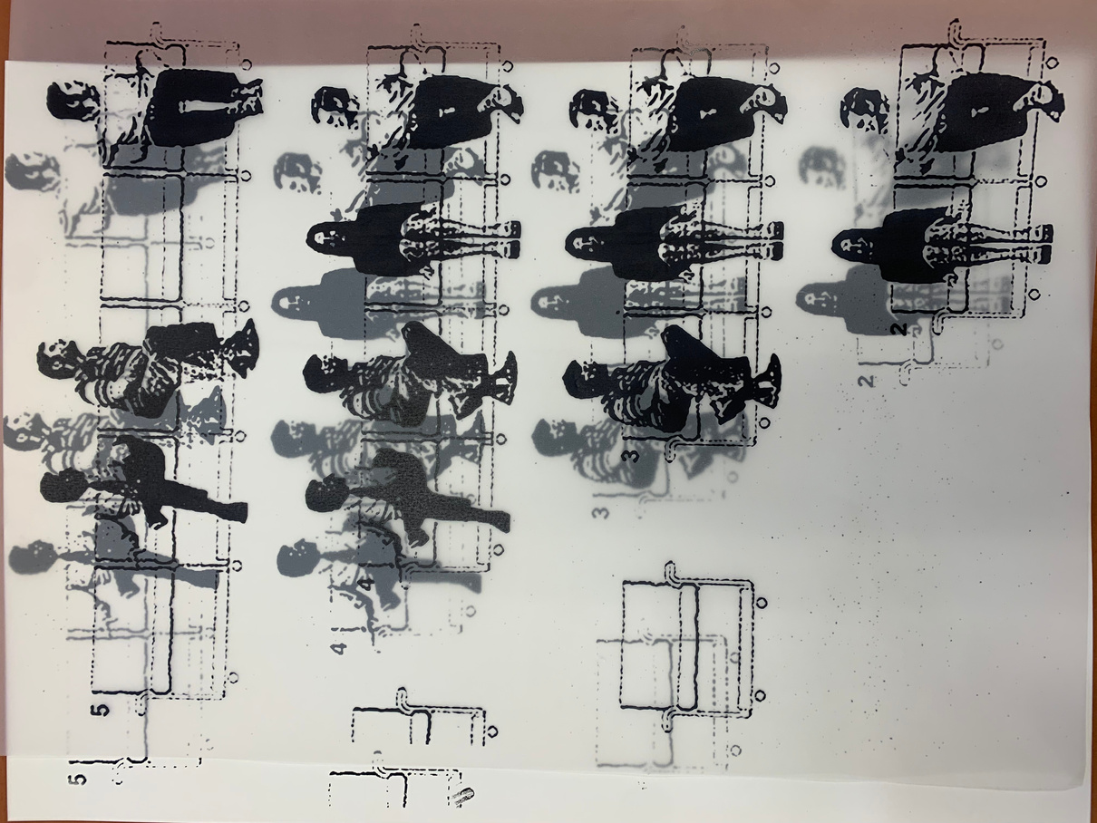
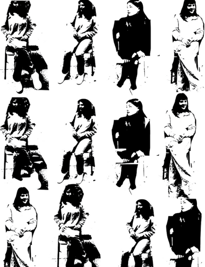
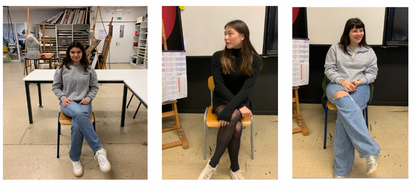
This is a pice of art in which I am working on is 'people' sitting on chairs next to one another. This artwork explores the idea that words have the power to bring people together, create understanding, and foster a sense of community. The chairs symbolize the act of listening, and the fact that they are positioned next to one another suggests a shared experience and the idea that we are all in this together. The posture of the figures, leaning forward and facing one another, further emphasizes the idea of active listening and the power of words to bring people together in meaningful conversation. This artwork speaks to the importance of listening and the role that communication plays in building strong relationships and creating a sense of community.
Something I might need to re-consider are: experiment with different color combinations: While black and red are a classic choice, I may want to try out different color combinations to see what works best.
another would be paying attention to my composition: Consider the placement and balance of elements, as well as the overall composition of the design. This will help ensure that my design is aesthetically pleasing and tells a compelling story.
Utilize texture: Adding texture to my design can give it more depth and interest. Experiment with different textures, such as halftones, to see what works best for this.
Consider printing techniques: whilst Screen printing can be a great way to reproduce my design and I am very familiar with it. There are other printing techniques I may want to consider as well.
Photos taken by Me (my own work)
Photos taken by Me (my own work)
Own resolved Final Work
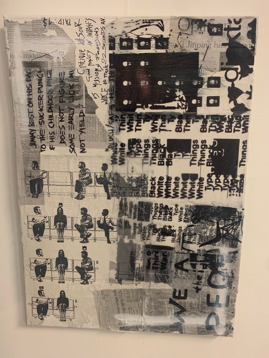
8. ‘Dic*tator’
Size:N/A
Material: Ink pen and vellum paper print on canvas
A printed piece in which depicts the power of words. The act of printing words and fonts onto Vellumpaper in this case has been seen as a physical manifestation of the power of words, as the words are now tangible and can be seen and touched. This physicality emphasizes the idea that political words have the power to shape our thoughts, beliefs, and actions, and that they can have a greater impact on the world.
The power of words has been recognized throughout history. From ancient literature and philosophical texts to contemporary political speeches and social media posts, words have the ability to shape our understanding of the world around us and influence our beliefs, attitudes, and behaviors.
When words are printed onto tangible materials like Vellumpaper, their power is intensified as they become more than just a fleeting thought or idea. The printed words become a physical manifestation of the message, making them more memorable and impactful.
In the realm of politics, printed words have played a significant role in shaping public opinion and driving social change. Political manifestos, speeches, and propaganda have been printed on paper to distribute widely and spread their message.
One example of the power of printed words can be seen in the role of pamphlets during the American Revolution. Revolutionary leaders, such as Thomas Paine, used pamphlets to disseminate their ideas and rally support for the cause. These pamphlets were printed on paper, making them easily shareable and accessible to a wide audience, and played a crucial role in mobilizing public opinion and sparking the revolution. In conclusion, the act of printing words onto paper emphasizes the power of language and its ability to shape our world. From ancient literature to modern-day political campaigns, printed words have been used to disseminate ideas, mobilize public opinion, and influence social change. The tangible nature of printed words makes them more memorable and impactful, and highlights the importance of language in shaping our thoughts, beliefs, and actions.
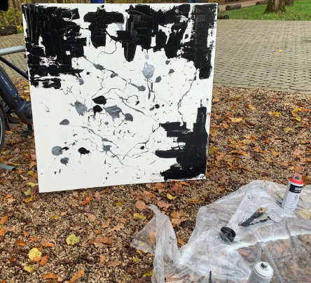
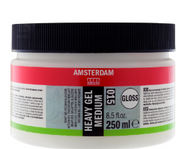
Gel: In order to create a large amount of texture in this piece I decided to us a Gel medium to create a transparent layer with much texture. I used a palette knife to spread a layer of soft gel gloss with a dab of acrylic in order to give color. This helped produce soft-edged brushstrokes and velvety textures. And the soft Gel worked very well as an adhesive because its smooth consistency allowed me to manipulate, move, and place materials or other paints ontop such as ‘spray paint’. It is not as ‘wet’ as other adhesives, so it allows the canvas to settle more quickly. Which was also very useful in a quick art piece like this.
My own process work
My own Artwork
Palette Knife: My main tool in which I used was the palette knife to create thin, usually broken lines which can look very natural in a painting. All I needed to do is load the edge of the palette knife with a thin amount of paint and then dab the edge on the canvas. Making sure the paint was evenly spread across the edge of the knife.
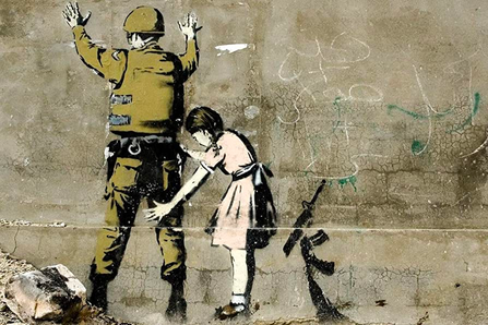
Like Jean-Michel Basquiat, Banksy also uses words and text as a key component of his art, often incorporating them into his signature stenciled style. In Banksy's work, the use of words and text often serves to provide commentary on current political and social issues. For example, in his 2005 mural "One Nation Under CCTV," Banksy used the words "One Nation Under CCTV" to critique the growing surveillance culture and the loss of privacy in modern society. In another work, "I Can't Believe You Morons Actually Buy This Shit," Banksy playfully mocks the commercialization and commodification of art In addition to providing commentary, the words and text in Banksy's work also serve to reinforce the message of his images. For example, in his mural "Girl with Balloon," the words "There is always hope" reinforce the image of the girl reaching for a balloon, which symbolizes the elusive nature of hope and the desire to attain it.
While using one of the many artists I am fond of. Basqiat. One of his many key elements in his work is the use of words and text. He often incorporated written phrases, words, and symbols into his paintings and drawings to convey his thoughts and messages. In many ways, the words in his work serve as a form of protest, challenging the existing social and political structures and drawing attention to issues of race, poverty, and oppression. For example, in his 1982 painting "Untitled (Death of racism)," Basquiat wrote the words "Death of Racism" in large block letters, emphasizing the urgency of addressing the issue of racial inequality. In other works, such as "Defacement (The Death of Michael Stewart)," Basquiat used text to commemorate the death of Michael Stewart, a young black man who was killed in police custody in 1983. The words and phrases in these works serve as powerful statements, highlighting the ongoing struggle for racial justice and equality.
My own Artwork
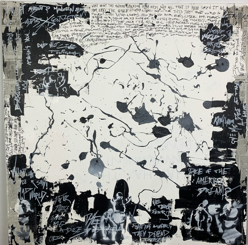
Canvas Size: 120x80
Media used:Spray Paint, White Gesso 1001, White pen, News paper Acrylic paints on Canvas
"The American Dream" is a song by American rapper Macklemore.The song reflects on the idea that the American Dream and how it has been distorted, and that people are chasing after a false version of success and happiness. I have embedded lyrics and words into this piece such as ‘doctor please give me a dose of the american dream’, with other pieces of his music from songs such as ‘Wednesday’ and ‘Same love’.
Furthermore the incorporation of other artists such as Basquiat and banksy were incorporated into this piece thus, Both Banksy and Basquiat's works can be seen as a commentary on the idea of the American Dream as a false and unrealistic construct, and the impact it has on society and the individual. By highlighting the flaws and limitations of the American Dream, both artists encourage people to question its validity and to seek out more meaningful and authentic ways of finding happiness and fulfillment.
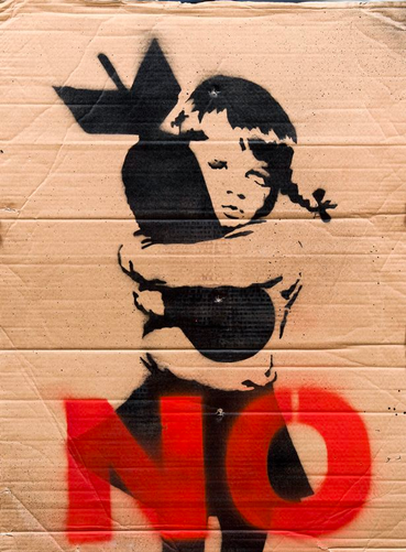
The image also questions the idea of using violence to solve problems and the impact it has on the next generation. Thus why the "Girl Giving Soldier a Gun '' and ‘girl hugging a bomb’ have been embedded with spray paint within this painting. Using symbolism to create a powerful message. These images show the power of words and how symbols can be used to convey ideas, emotions, and messages. Through these images, Banksy comments on the impact of violence and war on society and the next generation, and encourages the audience to reflect on these issues.
The name "untitled" suggests that I wanted the focus to be on the message and the imagery rather than a specific title. By not giving the piece a title, I am encouraging the audience to form their own interpretations and draw their own conclusions from the work. The name "untitled" also allows the piece to be open-ended and subject to multiple interpretations, further emphasizing the themes of the American Dream and the impact of violence on society.
Own resolved work
'Untitled'
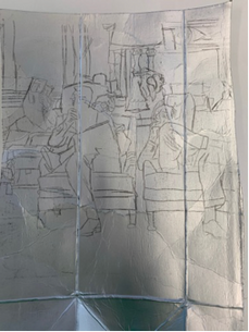
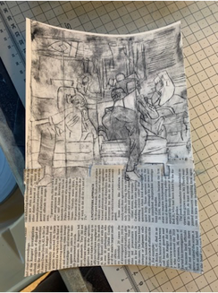
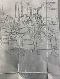
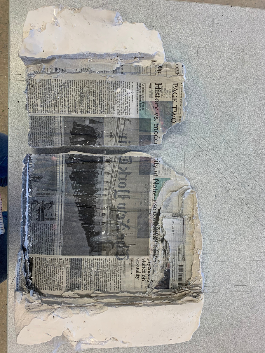
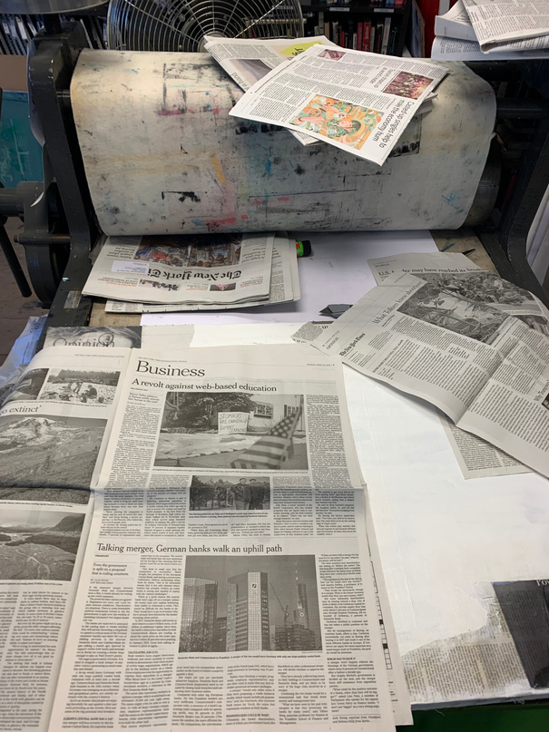
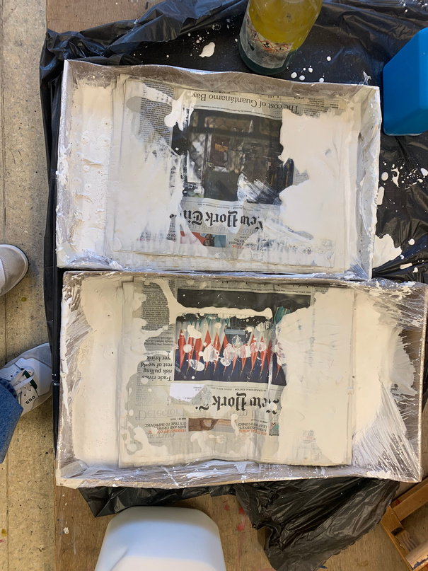
The process of creating 'The News Set in Stone' involves several steps. First, a layer of plaster is poured onto a flat surface, such as a table or board. Once the plaster has started to set, newspaper articles are carefully arranged on top of the plaster, face down. The articles are then covered with another layer of plaster, creating a sandwich-like structure with the newspaper trapped inside.
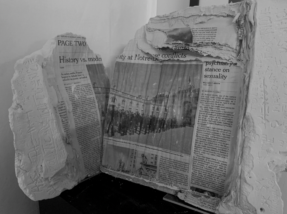
As the plaster dries, it hardens and forms a solid block. Once the plaster is completely dry, the piece is carefully removed from the surface it was poured onto. The surface is then sanded and polished to reveal the newspaper articles embedded within the plaster. The essence of the power of words. The newspaper articles, which represent current events and the news of the day, are preserved within the plaster, symbolizing the lasting impact of the words that were printed on the page. The use of plaster as a material further emphasizes the idea that words can build and construct, as well as break down and destroy our society.
In addition to the aesthetic appeal of the piece, 'The News Set in Stone' serves as a powerful reminder of the importance of words and their ability to shape our world. The permanence and durability of the plaster and the embedded newspaper articles suggest that the impact of words can last for generations, long after the initial printing on the page may have faded away.
Overall, the process of creating 'The News Set in Stone' involves a careful and intentional approach to capturing the power of words in a tangible and enduring form. The result is a thought-provoking piece that encourages us to reflect on the lasting impact of the words we use and the messages we share.
(my own work)
(my own work)
'The News Set in Stone' can be related to his broader exploration of the power of words and language. The process of creating the piece involves capturing newspaper articles, which represent current events and news, in a durable and lasting material. By embedding the newspaper articles in plaster, Arsham symbolizes the permanence and lasting impact of words.
Moreover, the process of pouring plaster over the newspaper articles can be seen as a metaphor for the way in which words can be used to build and construct. The plaster solidifies and creates a solid block, representing the potential for words to build structures and foundations that can withstand the test of time. At the same time, the plaster's potential for breaking down and destroying also emphasizes the importance of using words responsibly.
Overall, 'The News Set in Stone' serves as a powerful reminder of the enduring impact of words and the responsibility we have in choosing the messages we share. Arsham's work encourages us to reflect on the ways in which words can shape our world and to consider the lasting impact of our communication.
(my own work)
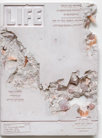
Stealing the ideas from Arsham, he too had conducted his piece by casting Life magazine covers in concrete, Arsham creates a tangible representation of the past that is both solid and enduring.
At the same time, the installation also serves as a commentary on the ephemeral nature of media and the news cycle. Life magazine was once a significant source of information and cultural influence, but with the rise of digital media, it has become a relic of the past. The use of concrete in the installation, therefore, highlights the contrast between the fleeting nature of media and the lasting impact of history.
Overall, Arsham's use of concrete in his Life magazine installation reflects his interest in archaeology and the idea of creating enduring artifacts that can withstand the test of time. The installation also serves as a commentary on the changing nature of media and the importance of preserving history and cultural artifacts.
Own resolved work
‘The News Set in Stone’
Material: Newspaper in plaster
(my own work)
The technique of engraving words into plaster surrounding the newspaper in "The News Set in Stone" adds an extra layer of meaning to the piece. It suggests that words have a tangible, physical presence that can shape and influence the world around us. The contrast between the ephemeral nature of newsprint and the solidity of plaster reinforces this idea.
In terms of the influence of Basquiat's work on this piece, it is possible to draw a connection between the use of language and symbolism. Basquiat was known for incorporating text into his paintings, often using fragmented phrases and cryptic symbols to create a sense of layered meaning. Similarly, "The News Set in Stone" uses the newspaper as a source of language, but by embedding it in plaster and engraving words around it, the artist creates a visual language that speaks to the power of words beyond their literal meaning.
Overall, "The News Set in Stone" is a thought-provoking piece that encourages viewers to consider the ways in which words can shape our world, both positively and negatively. Its use of plaster and newspaper as materials, as well as the incorporation of engraved words, adds depth and complexity to its message.